
Planned Giving Website Assessment
Is Your Website Helping or Hurting Your Efforts?
A Look Back at Website Evolution
Let’s do a mini planned giving website assessment. First, we’ll start by looking at how websites were used in the past, and how websites are used now. Take a minute to look at this photo.
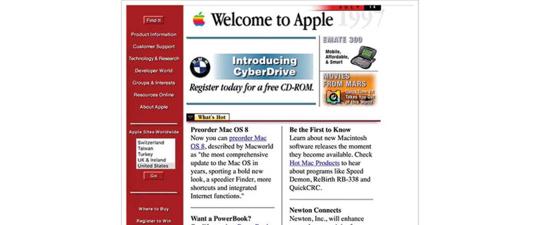
Does that look like a modern site? No. Of course not. This is a picture of an ooooold Apple site. In those dial-up days, the only requirement for a business or nonprofit was to HAVE a site.
But times changed…
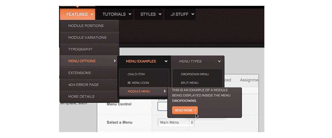
This next picture shows an “updated” site.
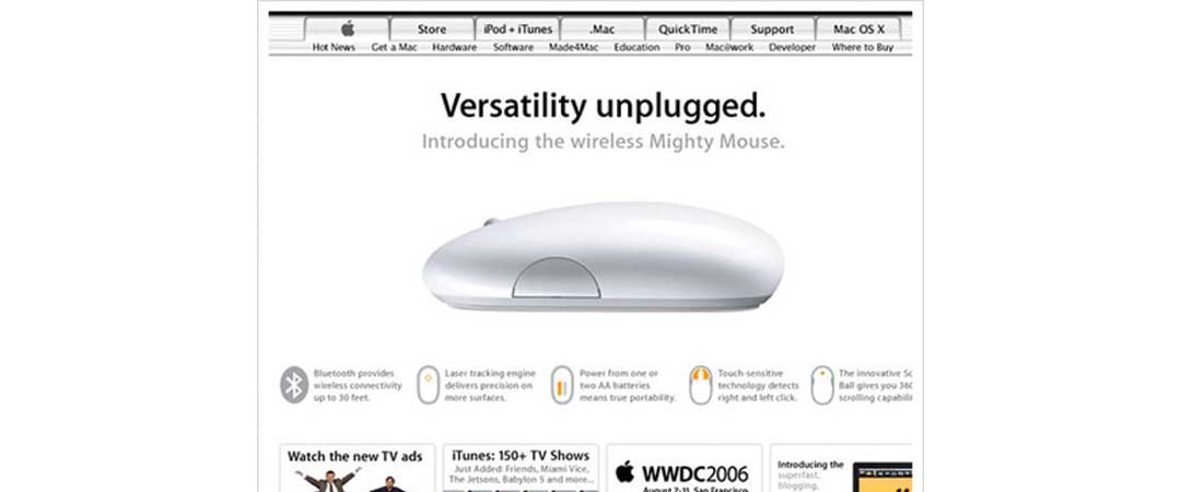
At this point websites were STUFFED with information. After years of an information frenzy, websites have settled down. The result is a clean, uncluttered design that offers relief to the user. Sites now are design focused, user-friendly, and responsive. They look like this:
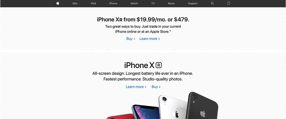
Today’s sites are built with the user in mind. They aren’t meant as an information depot.
It’s absolutely essential for it to look good on any device—a phone, tablet, laptop or desktop.
HAS YOUR PLANNED GIVING WEBSITE STAYED CURRENT?
I have some good news and some bad news. First, the bad news: if your planned giving website doesn’t meet the standards of today’s modern website, you’re going to look dated. And if your site looks dated, donors are going to think your information is dated—and they’re going to leave. That’s called a “bounce” in web-speak, and it could cause nonprofits to lose opportunities to engage.
But we have good news: if your planned giving website looks dated, clunky, and cluttered, it’s simpler than ever before to fix it.
TIME TO ASSESS YOUR PLANNED GIVING WEBSITE
How does your organization’s current planned giving website stack up against today’s standards? Be honest now…
THE DESIGN
Too many options in the menu tabs
If a person comes to your site looking for information on planned giving, they may not know what they’re looking for. When we welcome them with a menu bar that has too many options, it’s confusing. And a confused mind always says no.
Too many drop-down options in the menu tabs
When your prospect scrolls over the menu, those drop-down pages catch the brain’s attention—and suddenly, he or she has an acute case of FOMO: FEAR OF MISSING OUT. It’s not long before your prospect is bored, confused, or distracted … And your planned giving website actually set up a system where you lose an opportunity to engage.

It’s not Mobile First Indexing (MFI) Compliant
One of the most obvious indicators that it’s time to update your planned giving website is this: it doesn’t play well with others. That means the website isn’t “responsive.” Did you know that more people get online via a tablet or phone (53%)? Make no mistake, grandma knows her way around an iPad! Google punishes sites that aren’t compliant by burying them in the search.
THE CONTENT
Common problems occur in the content as well:
- Too much information
- Too much too soon
- Too much legalese
- No call to action so readers are clear on the next step
Too much information
Have you ever found yourself listening to someone with genuine interest and then find your eyes glossing over as they start getting technical? That’s how some planned giving websites make prospects feel. In the old days of the website, people were enamored with the availability of the information, so they would linger, peruse, and maybe even educate themselves. That’s the exception today.
Today, the digital age makes is so easy to get information that our brains are fatigued with info overload. Now, we consume information in bite-sized pieces so we avoid the feeling of being sprayed with a virtual garden hose of content. When prospects feel overwhelmed, their brain looks for an escape hatch—and with a click, they jump off the cluttered planned giving website, and they’re gone.
Too much too soon
Imagine meeting someone new and before you introduce yourself or even talk about the mission of your organization, you start talking about money, taxes, the best ways to alter a will, and how much your organization benefits from planned gifts.
You wouldn’t do that in person. Why do it on your planned giving website?
Your planned giving website should be a beginning, an introduction to you, the members of the legacy society, and possibility for impact. The content on the planned giving site should be emotional, not technical. The stories should inspire, with personal language and real-life stories. The goal is to connect friends and supporters to an opportunity that benefits them and empowers them to advance a mission they love.
Too much legalese
The planned giving website has one job: to inspire prospects to contact you. That’s it. It’s a tool to get your prospect to engage with you. Once they do, you can nurture a relationship and help them see the opportunity to build a legacy through your organization. When you use templated or legal-heavy information on your planned giving website, it feels overwhelming, impersonal, and sterile. And that makes prospects feel like you’re more interested in hearing about their resources for planned gifts rather than their reasons.

The ASK: Does a visitor know what to do next?
As you continue your planned giving website assessment, ask yourself: is there an opportunity on your planned giving website for your prospects to ask a question? Or does the site feel like a one-sided conversation? It’s essential for your planned giving website to invite prospects to engage. Without an invitation to engage, they may leave without ever letting you know they’ve visited!
WHAT’S YOUR ASSESSMENT?
Congratulations if your website is doing its job! If you saw places for improvement, I have some really good news. The solution is easier (and less expensive!) than you might think.

The PGMicrosite: A MODERN SOLUTION
In the past, planned giving websites were a huge investment. But a PGMicrosite™ changes all that. Now you can get a modern, effective planned giving website that actually does what it’s supposed to do: engage prospects. A PGMicrosite™ gives you everything you need in a planned giving website—and nothing that you don’t. It’s affordable, you aren’t locked into a long subscription, and you can get started in under 30 days. Call (484) 680-7600 now to get started—or click here to schedule a call.
Get a new PGMicrosite in as little as 30 days
A PGMicrosite gives you everything you need and nothing that you don’t so more donors and prospects engage. Call now to get a site and start engaging more donors.